Grooming your dream job starts with a single document: your resume. With today’s competitive job market, every detail counts, and who knows, the type you choose can have a big impact on how your resume ends up next to the human recruiters and Applicant Tracking Systems (ATS).
It is a small matter but using the right type can make your resume more readable, convey professionalism, and ultimately permit your credentials to get through.
Choosing the best font for resume writing is not just about looks; it’s strategic. The font you select quietly communicates the message of your commitment to detail and knowledge of professional etiquette. Get it right, and you make the reader’s job easier. Get it wrong, and you risk your perfectly written resume being overlooked or worse, misinterpreted. Let’s find out why fonts are so important and which ones can make a difference.
Table of Contents
The Impact of Font Choice on Your Resume
First impressions matter, and your resume is often the very first impression that a potential employer receives of you. The font serves as the visual ‘voice’ of your report before even a single word is actually computed. This is why it matters:
- Readability: Hiring managers typically take only seconds to scan each resume initially. A readable, clean best font for resume makes it easy for them to quickly glance at your most significant skills and experiences. Unreadable fonts, either too elaborate or too condensed, create resistance and may lead to your resume being put aside.
- Professionalism: Your best font for resume choice expresses your professionalism quietly. Traditional, standard fonts convey seriousness and respect for convention, which is generally appreciated in most careers. Highly casual, decorative, or unusual fonts can make you come across as unprofessional or detached.
- ATS Readability: Many businesses use Applicant Tracking Systems (ATS) to prescreen resumes prior to human evaluation. ATS scans the text in your resume looking for keywords and relevant information. Unusual or complex fonts will confuse ATS programs and lead to error parsing your information or worse, the total rejection of your application. Familiar, generally accepted fonts are the best assurance of ATS readability.
- Visual Attraction and Branding: While professionalism is the top priority, your choice of best font for resume is also a key element in crafting an ATS-friendly, visually appealing resume. The right font, paired with proper resume formatting—think generous white space, clear hierarchy, and concise headings—creates a clean, unified look that enhances your personal brand as a detail-oriented professional. This attention to detail not only helps recruiters focus on your accomplishments but can also boost your overall Resume score when evaluated by a Resume Checker, signaling to hiring managers and Applicant Tracking Systems that your document is polished, well-structured, and easy to read.
Magical Resume Checker
Discover the full potential of the Magical Resume Checker and explore the various options available to enhance your resume, optimize it for applicant tracking systems (ATS), and improve your chances of landing your dream job.
Why Font Choice Matters Beyond Aesthetics: The ATS Factor
We touched on Applicant Tracking Systems (ATS) briefly above, but it is worth discussing in greater detail why this is quite possibly the most significant technical reason to be selective about your resume font. These software programs are the screeners, sorting through potentially hundreds or thousands of applications for a particular job. Their primary function is to parse text data efficiently.
Here’s the issue: ATS software isn’t coded to appreciate beautiful typography. It’s coded to locate and extract standard characters and text blocks.
- Standard Fonts are a Must: ATS systems have internal libraries of standard fonts that they readily recognize. Using standard serif fonts (e.g., Georgia, Garamond, Times New Roman) or sans-serif fonts (e.g., Arial, Calibri, Verdana) significantly increases the likelihood that the system will correctly read your resume.
- The Danger of Script or Custom Fonts: Highly decorative script fonts, extremely ornamental fonts, or fonts from the darker corners of the web are typically unreadable to ATS. The system might read them as jumbled letters, blank spaces, or not read the text altogether. That would mean your painstakingly listed skills and experiences might never be noted.
- Ligatures and Special Characters: Some fonts use ligatures (two letters combined into a single glyph, e.g., ‘fi’ or ‘fl’) or special characters that are non-standard. These also tend to trip up ATS parsers. It is important to use fonts that use standard character sets.
Consider it this way: selecting an ATS-compatible font is similar to making sure that your message is written in a language that the receiver can comprehend. Picking a decorative, incompatible font is comparable to sending a message in code without sending the decoder ring. Your objective is obvious communication, and that begins with a font the machines can decipher.
Read More : What Is a Cover Letter for a Resume
Top 10 Fonts Recommended for Professional Resumes
So now that you know the ‘why’, here’s the ‘what is the best font for resume writing’. While there isn’t one size fits all answer to “what is the best font for a resume”, a few always remain safe, professional, and clear to read. Below are 10 excellent choices, both serif and sans-serif:
Sans-Serif Fonts (Clean, Modern, Often Better On-Screen):
- Calibri: Default for Microsoft for years, Calibri is reassuring, readable, and easily readable on screen. Professional but not formal. Extremely conservative choice.
- Arial – best font for resume: Classic sans-serif Arial is ubiquitous and familiar to basically every system (including ATS) and is on virtually any system supporting fonts. Simple and professional, but a tad generic to some.
- Verdana: Screen-readable in particular, Verdana has open spacing and wide characters and is thus extremely readable even at tiny sizes.
- Helvetica – best font for resume: The designer’s choice, Helvetica is neat, professional, and unpretentious. Just make sure you actually have Helvetica and not just use substitute Arial if it’s not installed. It sometimes feels a bit corporate or chilly.
- Lato: A personal favorite among Google Fonts, Lato finds a great balance between professionalism and approachability. It’s modern, highly readable, and has a friendly feel without being casual.
- Open Sans – best font for resume: Another highly rated Google Font, Open Sans is famous for its excellent readability on the web and mobile devices. It’s clean, neutral, and versatile.
Serif Fonts (Traditional, Classic, Often Easier for Print):
- Georgia: Screen-legible but with traditional serif character, Georgia is more readable and robust at low point sizes than Times New Roman. It presents a conservative yet friendly look.
- Garamond- best font for resume: Stylized, elegant serif face. Can give a formal, traditional appearance to your resume. Apply sparingly because it will tend to print a little smaller than the other faces at the same font size, so you will need to size it up somewhat.
- Cambria- best font for resume: Another Microsoft default font (typically paired with Calibri), Cambria is a solid serif best font for resume that displays well on screen without losing traditional letterforms. It reads very well at small sizes.
- Times New Roman: The outdated standard classic. Although perfectly fine and very ATS-friendly, some deem it old-fashioned or generic because of excessive use in scholarly papers and default settings. Nevertheless, it’s unequivocally professional and readable.
Finally, the most suitable resume font for you will be your profession, personal taste, and how it appears with your own matter and look.
Key Factors When Choosing a Resume Font
In addition to selecting from the list below, keep these factors in mind when you make your final choice:
- Readability At All Costs: Can one readily scan the text without straining one’s eyes? Is it readable on screen as well as when printed? Avoid very condensed, very light, or very decorative typefaces.
- Professional Tone: Is the font suitable for the kind of work you’re looking for? Creative industries may permit a little more personality (but still be concerned with readability and ATS-friendliness!), whereas conservative professions (law, finance) typically require old-fashioned selections. Stay away from fonts that look anything like Comic Sans, script fonts, or novelty fonts.
- ATS Compatibility (Again!): It can’t be stressed enough – utilize standard, widely accepted fonts. In case you are unsure, choices like Calibri, Arial, Georgia, and Verdana are extremely safe options.
- Consistency: Choose one body base font and perhaps another for headings (or a bold/larger version of your body font). Use no more than two fonts, and use consistently throughout the document. Using the same font family (e.g., Lato Light body, Lato Bold headings) normally will be enough.
Maintaining these concerns in mind aid in narrowing down the options and ensures your final decision enables your wish to create a better, refined, professional, and productive resume. The procedure of searching for the best font for a resume involves negotiating such practical considerations.
Font Size and Styling Considerations
Choosing the best font for resume itself is only half the fight. Styling and sizing it also matters a lot.
- Font Size: Optimum size varies a bit by best font for resume used since some fonts appear larger or smaller than others. However, an all-around rule of thumb for body copy is 10 to 12 points. Anything below is difficult to read quickly, and anything above makes your resume read as too unprofessional or too lengthy. For your names and section titles, you may use a little larger, such as 14 to 16 points, to establish visual hierarchy. Determining ideal font size for resume legibility is very important.
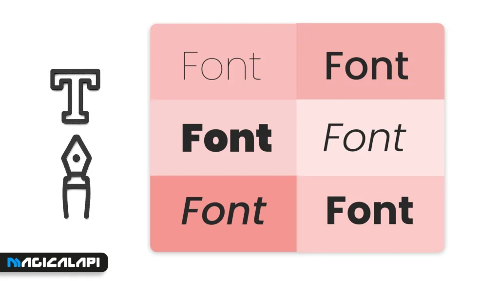
- Bolding and Italicizing: Employ bolding and italicizing sparingly and strategically. Bolding is great for section headings (e.g., “Work Experience,” “Skills”) and job titles to make them stand out. Use italics sparingly, maybe for dates or some sub-headings, but don’t overdo it because they can make it less readable. Never use underlining since it can disrupt ATS parsing (thinking it’s a hyperlink) and looks outdated.
- ALL CAPS: Never use all caps for entire paragraphs or sentences. It’s tiresome to read like screaming and more difficult to read than regular sentence cases. Only use it for short headings if absolutely necessary, or perhaps for acronyms.
- Consistency: Whatever size and styling rules you decide on, use them consistently to the entire resume. All headings must be the same size and type, all job titles the same, etc. This provides a clean, neat, and professional appearance.
Final Tips for Crafting a Resume with the Perfect Font
You’re close! Before sending, finish these last steps to get your font choice just right:
- Test Print: Print a single copy of your resume. Fonts can look different on paper than on the screen. This lets you check readability and overall look in the form a typical interviewer would see it.
- Save as PDF: Unless otherwise requested, always save and submit your resume as a PDF. This keeps your formatting, including your preferred font, intact no matter what software or operating system the recruiter is using. Sending a Word document has the potential to have the formatting altered or the best font for resume defaulted to something different if the recipient does not have your preferred resume font installed.
- Test ATS Compatibility (One Last Time!): If you’re not certain of your resume font, try posting your resume to an online ATS checker (some job sites or career services offer these) to see how the information is interpreted.
- Get Feedback: Have a trusted friend, mentor, or career counselor take a look at your resume. Request their opinion on the overall appearance, readability, and professionalism – including the choice of font. A second pair of eyes will catch things you’ve missed.
- Consistency is King: Double-check that best font for resume choices, sizes, and styles (bolding, italicizing) are employed consistently throughout the whole document. Inconsistencies give the impression of sloppiness.
Picking the best font for resume is a simple yet powerful way of making your resume as effective as possible. Taking the time to pick one of the fonts that are widely included as the best font to use when presenting a resume demonstrates attention to detail – something that any job candidate can appreciate.
Be ready for your resume to stand out!
Your resume acts as your ambassador when looking for employment. Although content – achievements, experience, and skills matters most, its acceptance is heavily based on appearance. And one of the foundations of this appearance is font selection. By using a clean, professional, readable, and ATS-friendly font like Calibri, Georgia, Arial, Verdana, or Lato, and pairing it with the correct sizing and styling, you’re left with a document comfortably consumed both by machines and by humans.
Do not let a poor font selection ruin your efforts. Make an informed, thoughtful decision. Choose Best font for resume that optimizes readability, conveys professionalism, ensures compatibility, and ultimately places your qualifications in the spotlight. Good luck!
FAQs For Best Font For Resume
1: Which font is best for resume documents overall?
There’s no single “best” font, as suitability can depend on personal preference and industry. However, widely recommended safe choices known for readability and ATS compatibility include Calibri, Arial, Georgia, Verdana, Lato, and Cambria. The key is choosing one that is clean, professional, and standard. Avoid novelty or script fonts.
What is the absolute best font size for resume text?
For the main body text (job descriptions, summaries), aim for 10 to 12 points. For section headings (like “Experience,” “Education”), use 14 to 16 points. Your name at the top can be larger, perhaps 18-22 points. Ensure it’s easily readable.
Should I use a Serif (like Georgia) or Sans-Serif (like Calibri) font?
Both can work well! Sans-serif fonts (like Calibri, Arial, Verdana) are often considered slightly more modern and easier to read on screens. Serif fonts (like Georgia, Garamond, Cambria) have small decorative strokes (serifs) and are often seen as more traditional or classic, sometimes preferred for printed documents. Choose based on the overall look you prefer and your industry norms, ensuring it’s readable and professional.
What is the best font for resume 2025 trends? Are there new fonts I should consider?
Resume font trends don’t change dramatically year to year. The focus for 2025 remains firmly on readability, professionalism, and ATS compatibility. Classic choices like Calibri, Georgia, Arial, and Verdana are still excellent. Newer, clean sans-serif fonts available through platforms like Google Fonts, such as Lato or Open Sans, have become very popular and are great modern choices that meet all the key criteria. Avoid overly trendy or decorative fonts that might quickly look dated or cause technical issues. The core principles remain the same.
Can I use a unique or custom font to stand out?
It’s generally not recommended. While you want to stand out, a unique font risks being unreadable by Applicant Tracking Systems (ATS). Furthermore, if the recruiter doesn’t have the font installed on their system, your resume might display incorrectly using a default font, ruining your careful formatting. Stick to standard, widely available fonts to ensure compatibility and professionalism. Stand out with your accomplishments, not your font choice.